The work of Arthur Erickson
I have been following this architect's work for many years, as he is
one of my favorites. If you have additional information on any of
these projects, it would be much appreciated - GH.
Short biography:
1924- , Canadian architect, born in Vancouver, BC. Considered one of
Canada's greatest architects. Studied at the University of British
Columbia and McGill University, and after traveling extensively in
Europe and the Far East, returned to practice in Vancouver. He
contributed to the rebirth of Modernism within Canada, and is known
for his unique ability to handle large-scale contemporary architecture
which is sensitive to its location by exploiting the effects of
various materials and structural systems. He has designed private
homes such as the Puget Sound House and the Newport Beach House,
public buildings such as the San Diego Convention Center and the UBC
Museum of Anthropology, the Vancouver Court House, Simon Fraser
University, and the Canadian Embassy in Washington, DC.
Chief Architect of Simon Fraser University
Simon Fraser University is known for
its world-renowned architecture. Located atop Burnaby Mountain in
Burnaby, British Columbia, a suburb of Vancouver, SFU's design was the
result of a competition held in 1963. The goal of the competition was
to produce five winners. One architect would be awarded first prize
for the overall design of SFU, while four other architects would each
be invited to build a section of the university under the supervision
of the winner. Only applicants from British Columbia could enter.
The design chosen was that of a young University of British Columbia
architecture professor, Arthur Erickson, and his colleague Geoffrey
Massey. The successful competition gave a considerable push to
Erickson's professional career.
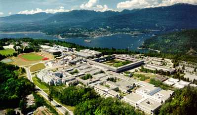 Erickson's design was innovative in several aspects. The mountain top
location inspired Erickson to reject multi-story buildings, which he
thought would look out of place. Instead, Erickson turned for inspiration
to the acropolis in Athens and the hill towns of Italy, where the
mountain was incorporated into the design itself. This concept is
evident in many aspects of the university's design. For example, the
manner in which the buildings are terraced to reflect the contours of
the landscape and the emphasis upon the horizontal rather than the
vertical expansion of the buildings themselves.
Another innovative aspect of the design was its rejection of the usual
separation of faculties and departments into individual buildings.
Erickson wanted to facilitate interdisciplinary work and a closer
relationship between faculty and students, so the design incorporated
buildings housed several departments as well as classroom space. This
measure satisfied the practical requirements of both students and
faculty by reducing the travel time between classes, and helped
foster an intimate learning environment.
Simon Fraser University opened in 1965 and was heralded worldwide as
an architectural success. The university's new buildings have remained
true to the original design principles conceived by its founding
architect.
Museum of Anthropology, University of British Columbia
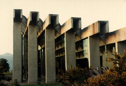
One of the world's most impressive displays of Northwest Coast First
Nations art is housed in an unusual building overlooking mountains
and sea at the northwest corner of the University of British Columbia.
Erickson wanted the design of the building to have a close
relationship with these dramatic surroundings. He worked to highlight
what he considers the four principal architectural elements: site,
light, cadence and space.
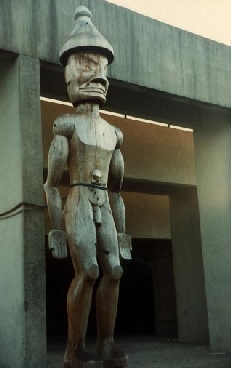 Erickson has had a long admiration and respect for the Native American
cultures, and for this reason he seemed an appropriate choice as
architect of the Museum of Anthropology. Retaining the natural
settings of Native American artifacts was a primary consideration, and
his desire to include the natural environment as part of the design is
in part accomplished via large expanses of glass. Natural lighting is
intentionally utilized to cast natural shade and shadow upon the
exhibits.
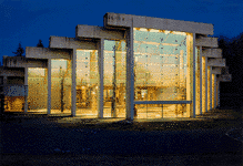 Erickson attempted to abstractly represent these natural conditions
indoors. He coupled changes in the character of the lighting with the
visitor's experience of moving through the building. Erickson said,
``Most of my concepts have to do with how one moves, and since the
site is sloped, I felt the whole movement should be down a long ramp
with more and more revealed, until the whole space burst open with a
view of the sea.'' In order to achieve that experience in the Great
Hall, Erickson enclosed the northwest-facing space with broad areas of
glass and a succession of concrete beams of increasing length
separated by slivers of skylight. There are conflicting opinions of
what these concrete piers are meant to mimic. Erickson is quoted by
one source as saying the posts and beams recall the form of the frame
of a tribal dwelling. Another source quotes Erickson as saying that
the piers simulate massive tree trunks. In either case, the Great Hall
represents the forest's edge, overlooking the prospect of the land and
water.
To heighten this experience, Erickson had intended to surround the
northwest side of the museum with an artificial lake, which would not
only complete the native environment which it sought to simulate, but
would also reflect the sunset, and bring ``moving light'' into the Great
Hall as the water rippled. Due to the site's location perched upon a
cliff above the strait, this artificial lake was intended to
seamlessly blur into the waters of the Georgia Strait, creating an
illusion of continuity with the distant landscape. However, this part
of the design was never implemented for cost reasons.
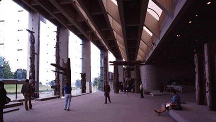 In Erickson's mind, one of the most successful aspects of the museum
is the way visitors move systematically through the galleries. The
ability to bring artifacts from the research collection out of
storage, allowing the public to view the full expanse of the museum's
collection was also very important to him. Overall, Erickson said he
strove for a ``tranquility of space'', where there is a resolution of
forces to bring the building into balance.
I highly recommend that you visit the Vital
Signs Project for more detailed information on the museum
building. Most of my information here was obtained from this site.
Chief Architect of the University of Lethbridge
The University of Lethbridge is
located in Lethbridge, Alberta, . The city, situated a short distance
north of the Montana border, is near to where the foothills begin to
rise towards the Rockies. Its setting is a vast and mostly treeless
plain.

In the late 1960's, a 572 acre expanse of land adjoining the Oldman
River was chosen for the development of a university campus to serve
Southern Alberta. When architect Arthur Erickson designed the
University Hall, he envisoned a building which would ride the rolling
coulees of the valley. It nestles into the folds of the coulee formed
by the river, and its long flat roof echoes the flatness of the
prairie above the coulee. The large campus, most of which is left
in an undeveloped, natural prairie state, only further emphasizes the
harmony between the land and the campus. Erickson's sculptural
architecture is a natural and fitting companion to the prairie
landscape.
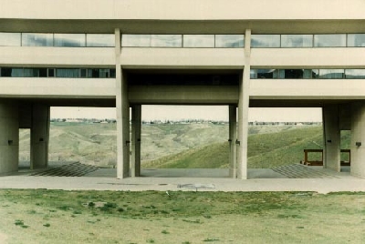
The University of Lethbridge campus was officially opened in 1972. It
has been expanded several times since, mostly in keeping with the
architect's original vision. The sensitivity of the campus
architecture to its context is a clear common link between this work,
and his others at Simon Fraser University and the Museum of
Anthropology.
Canadian Embassy in Washington, DC, USA
The Canadian embassy sits on one
of the most prestigious sites in Washington, DC, on Pennsylvania Avenue, just
down the street from the Capitol Building, and across the street from the
National Gallery. No other nation has been accorded such an honorable location
in Washington for its embassy. The choice of Arthur Erickson as architect was
controversial, as the then-Canadian Prime Minister, Pierre Trudeau, personally
decided upon Erickson, overruling the decision of the embassy's design
committee.
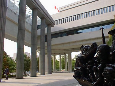
The embassy is a blend of neoclassic and modern concepts, with
a facade of smooth, unpolished Canadian marble that echoes the
monuments around it. The embassy consists of three wings and six
freestanding 50-foot that surround a spacious courtyard. The
courtyard symbolizes the vastness of Canada's geography and the
openness of its people. The colonnade, which supports a narrow
plexiglas skylight, initiates the play of scales that is a primary
feature of the building.
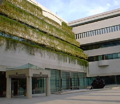 The slender triangular pillar that anchors the embassy's southeast
corner echoes the angles of I.M. Pei's modernist East Building of the
National Gallery of Art. The Rotunda of the Provinces is supported by
12 columns, one for each of the 10 provinces and the two oldest
territories (Nunavut was later created in 1999), clustered within a
cascading pool. The interior of the building is characterized by
sharp, crisp angles and shapes, Arthur Erickson's architectural
trademark, and the use of four materials: stone, metal, concrete and
glass.
Various Public Buildings on the Pacific Coast
Robson Square, Vancouver, BC

``A 3-block long complex whose concrete construction and geometric
lines are softened by lots of plantings-even on roofs-plus a pool,
waterfalls, and intricate patterns of stairs and ramps. Included are
a 7-story Law Courts Building with a tilted glass roof and exposed
structural framing, a lower-rise government office building, an indoor
mall, outdoor plazas, and an old courthouse transformed into the
Vancouver Art Gallery.''
-from Sylvia Hart Wright. Sourcebook of Contemporary North American
Architecture: From Postwar to Postmodern. p27.
I would like to thank Melvin W Buxton for the aerial view of the Robson Square complex.
City Hall, Fresno, CA
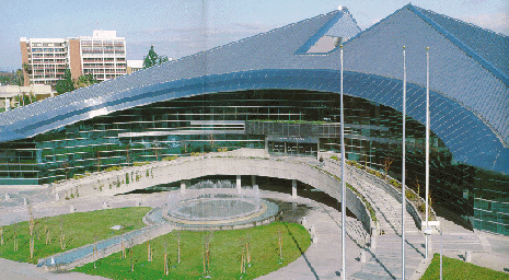
This 5 story, 201,750 square foot structure is designed as a metaphor
of Fresno's geographic setting. Both the expansive feeling of the
valley and the thrust and shape of the Sierra Nevada are portrayed
in the shape of the building. The outside metallic trim is Sea Foam
Green from the Chrysler corporation '63 autos, and the roof is comprised
of 2 acres of stainless steel.
Convention Center, San Diego, CA
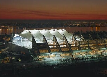
The San Diego Convention Center
I have no information on this building at this time.
 Back to Garth's Hall of Architecture.
98.12.30 / Garth Huber / modified 05.07.04
 Erickson's design was innovative in several aspects. The mountain top
location inspired Erickson to reject multi-story buildings, which he
thought would look out of place. Instead, Erickson turned for inspiration
to the acropolis in Athens and the hill towns of Italy, where the
mountain was incorporated into the design itself. This concept is
evident in many aspects of the university's design. For example, the
manner in which the buildings are terraced to reflect the contours of
the landscape and the emphasis upon the horizontal rather than the
vertical expansion of the buildings themselves.
 Erickson has had a long admiration and respect for the Native American
cultures, and for this reason he seemed an appropriate choice as
architect of the Museum of Anthropology. Retaining the natural
settings of Native American artifacts was a primary consideration, and
his desire to include the natural environment as part of the design is
in part accomplished via large expanses of glass. Natural lighting is
intentionally utilized to cast natural shade and shadow upon the
exhibits.
 Erickson attempted to abstractly represent these natural conditions
indoors. He coupled changes in the character of the lighting with the
visitor's experience of moving through the building. Erickson said,
``Most of my concepts have to do with how one moves, and since the
site is sloped, I felt the whole movement should be down a long ramp
with more and more revealed, until the whole space burst open with a
view of the sea.'' In order to achieve that experience in the Great
Hall, Erickson enclosed the northwest-facing space with broad areas of
glass and a succession of concrete beams of increasing length
separated by slivers of skylight. There are conflicting opinions of
what these concrete piers are meant to mimic. Erickson is quoted by
one source as saying the posts and beams recall the form of the frame
of a tribal dwelling. Another source quotes Erickson as saying that
the piers simulate massive tree trunks. In either case, the Great Hall
represents the forest's edge, overlooking the prospect of the land and
water.
 In Erickson's mind, one of the most successful aspects of the museum
is the way visitors move systematically through the galleries. The
ability to bring artifacts from the research collection out of
storage, allowing the public to view the full expanse of the museum's
collection was also very important to him. Overall, Erickson said he
strove for a ``tranquility of space'', where there is a resolution of
forces to bring the building into balance.


 The slender triangular pillar that anchors the embassy's southeast
corner echoes the angles of I.M. Pei's modernist East Building of the
National Gallery of Art. The Rotunda of the Provinces is supported by
12 columns, one for each of the 10 provinces and the two oldest
territories (Nunavut was later created in 1999), clustered within a
cascading pool. The interior of the building is characterized by
sharp, crisp angles and shapes, Arthur Erickson's architectural
trademark, and the use of four materials: stone, metal, concrete and
glass.


 Back to Garth's Hall of Architecture.